Subscan
UX audit and redesign direction for an existing blockchain explorer
UX Audit
Chain explorer
Subscan is an established blockchain explorer used to navigate on-chain data across multiple networks. Subscan asked us to audit their existing platform and provide an external, independent perspective before starting a redesign. The goal was to understand how real users interacted with the product and to identify usability issues and opportunities for improvement.
Annotated UX audit of Subscan landing page highlighting CTA confusion, unclear messaging, and navigation issues.

Challenge

The challenge was to evaluate a complex, data-heavy product that serves both everyday users and more advanced, power users. The platform contained a wide range of information and functionality, making it difficult to balance clarity, discoverability, and efficiency without oversimplifying core use cases.

Our work included

User research
Ux audit
user interviews
task-based usability testing
analysis of navigation, data hierarchy, and terminology
Key questions were
  • How users understand and navigate chain data?
  • Which information is essential at different stages of the journey?
  • Where complexity creates friction or confusion?
  • How to support both everyday and power-user workflows?
Main Focus
We focused on understanding how users made sense of on-chain data and how easily they could complete common tasks.
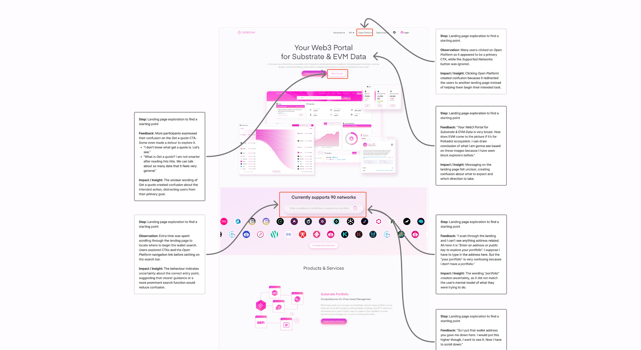
Audit results
1. Unified entry and search logic
Users were confused by multiple landing pages and inconsistent search behavior. We identified that users expected to paste any identifier (wallet address, extrinsic, network) into a single search field. We proposed a unified entry point with a persistent, adaptive search that detects input type and guides users to valid results across networks.
2. Clarifying account vs. portfolio and restoring orientation
Users struggled to understand how portfolio data related to account pages and frequently lost orientation due to missing hierarchy and breadcrumbs. We recommended integrating portfolio as a clearly labeled tab within the account view and introducing consistent navigation and breadcrumbs to support predictable movement across the platform.
3. Making multisig and proxy roles visible
Critical account roles such as multisig and proxy status were hidden behind secondary navigation, requiring excessive effort even for expert users. We proposed surfacing these indicators directly on account pages, supported by visual summaries to reduce investigation time and cognitive load.
The Outcome
Rather than proposing a full visual redesign upfront, we delivered a structured UX audit that prioritized issues by impact and frequency, and paired each finding with clear explanations and redesign recommendations.

Subscan received a detailed audit document outlining key usability issues, supported by evidence from user interviews and task observations, along with concrete suggestions for improving navigation, data presentation, and overall usability. The audit served as a foundation for future redesign work.
Subscan logo

The collaboration was smooth and well-structured. The insights were clearly presented, and the annotated Figma user flows made the findings easy to turn into actionable design improvements.We’re very satisfied with the outcome. The work provided clear direction for our upcoming website revamp and is now a key reference for our design and product decisions.

Trayton

CEO & Co-founder